
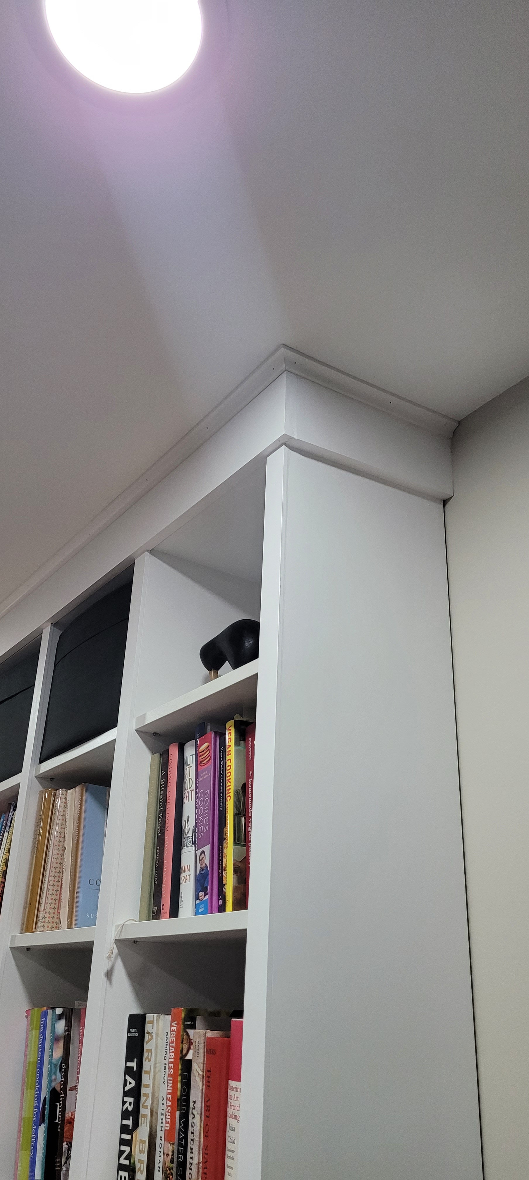
So, late last summer, we began building The Beast out — the affectionate name we’ve given for the pantry cabinets at the back of our kitchen.

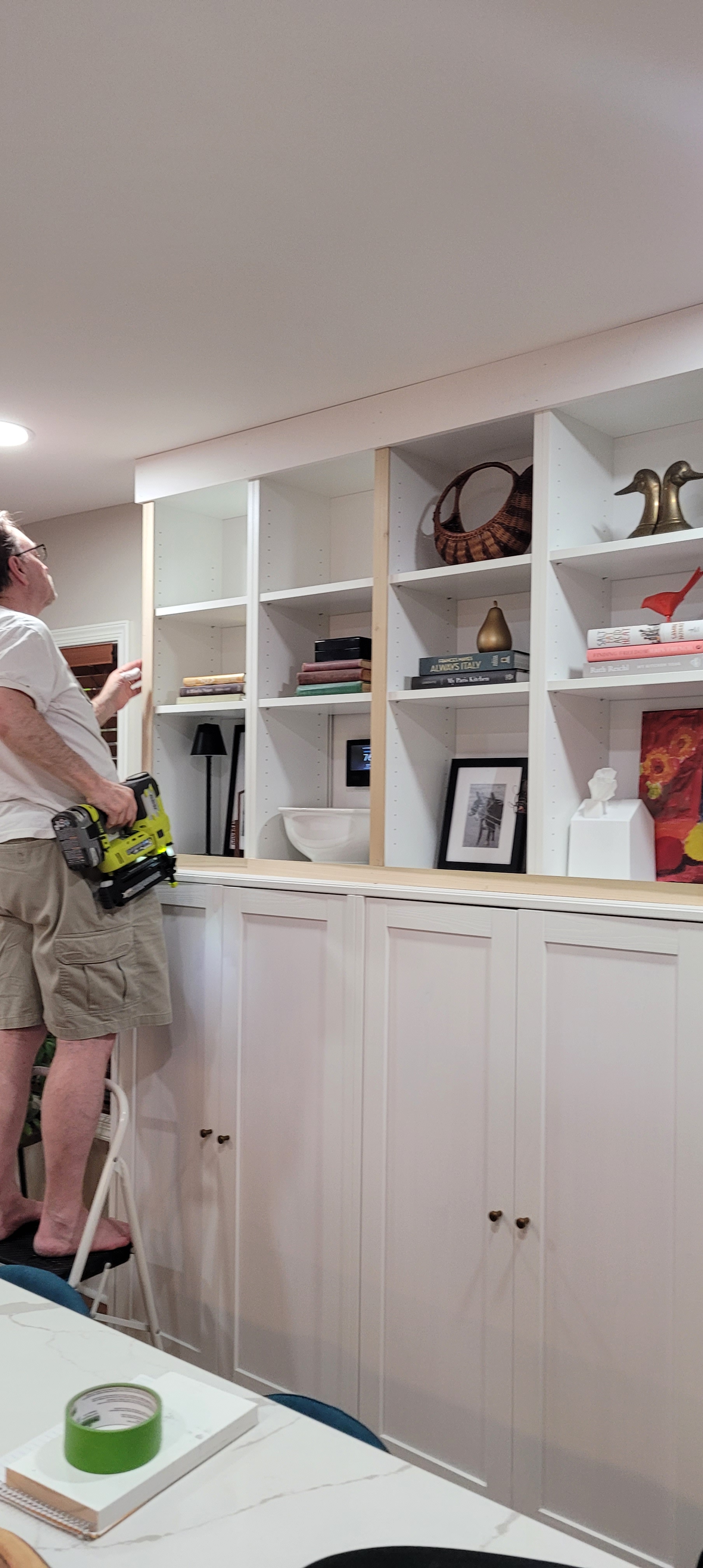
When all was said and done, it seemed like a no-brainer to paint the cabinets white to match the rest of the kitchen cabinetry and keep things in the low-contrast zone we find ourselves most comfortable. Muddy grey, white, and an occasional pop of black is our jam, baby.
Ikea, for some unknown bizarre reason, does not make matching cabinetry paint. If you get a nick on your cabinet, or if you are trying to match filler pieces to your cabinet, good luck with that. If you have cabinets with color other than white, you may be be able to do a solid color match at your paint store. But, white is a notoriously difficult color to match, even if you bring the whole drawer front into the store.
Never fear, though, we are fortunate to have a consultant on call for just these kinds of dilemmas. His name is Dr. Google and from what we could gather from our research, we are the one billionth person to have this issue. The consensus on the interwebs was to use Behr Premium White in Matte for the closest match possible.
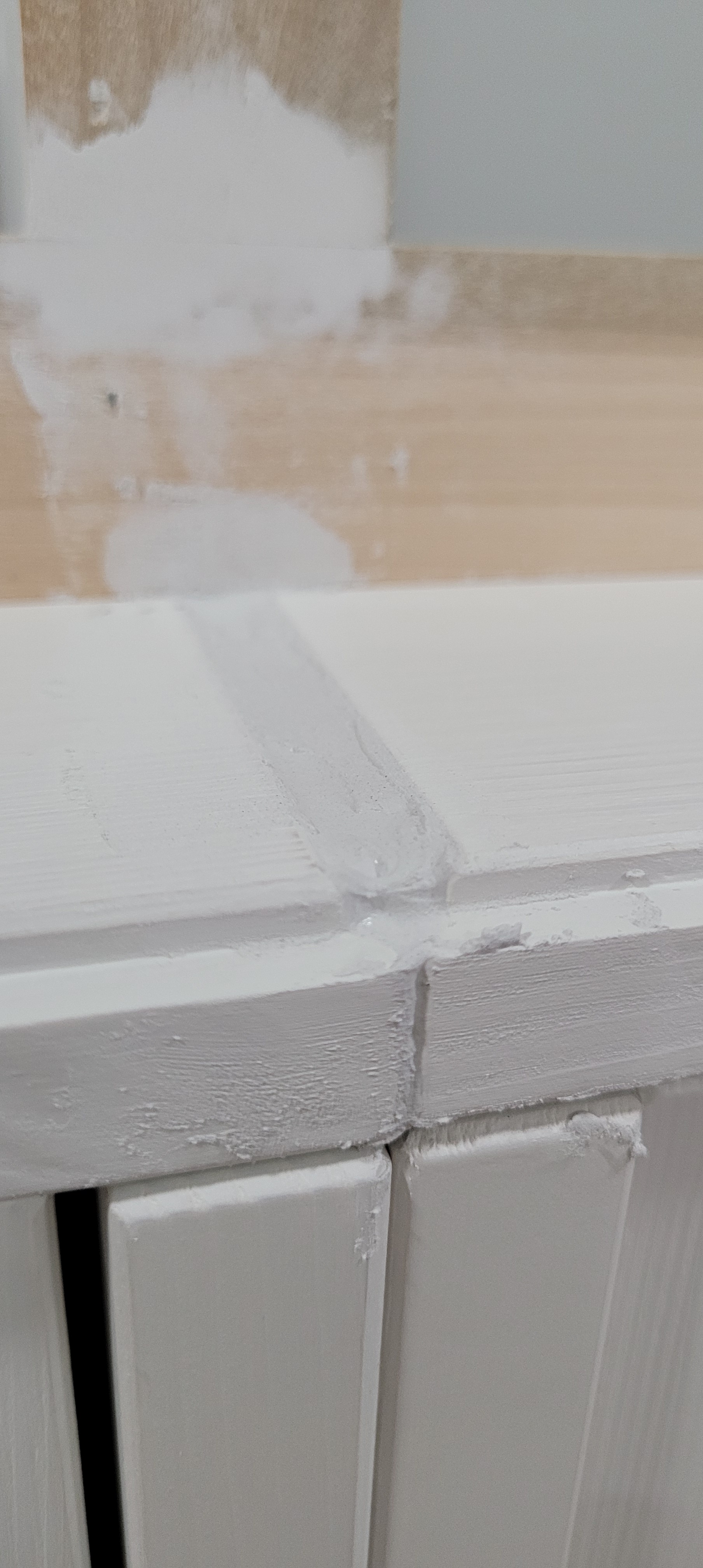
Welp, not the first time Dr. Google has led us astray [remembering that rash on my left ankle which ended up not being early onset malaria, but rather a simple mosquito bite]. To be fair, the color does match fairly well, but the sheen and the finish is all wrong. No one is going to mistake The Beast for something that was factory finished, lemme tell you.
While it doesn’t look too shabby, if we do say so ourselves, something just wasn’t quite right. We couldn’t put our finger on it and decided, since this was the last big thing we had to check off our list for the kitchen reno to be done and dusted, we would live with it for a hot second and see if it grew on us.
So, here we are, many months later, and I think we have figured out the disconnect. The piece is chalky (hello paint), and too white. I mean, the thing could bring home ships in the dark of night. It also gives off hospital clinic vibes – not exactly the aesthetic we were shooting for.
To be honest, we were so tired after a year of reno that we probably would have lived with it forever. But, then, a bad thing happened that ended up being just the catalyst we needed to get back on the reno horse and give it another go. The crown moulding that we had affixed to the top of the unit for that quintessential built-in look started separating from the ceiling!
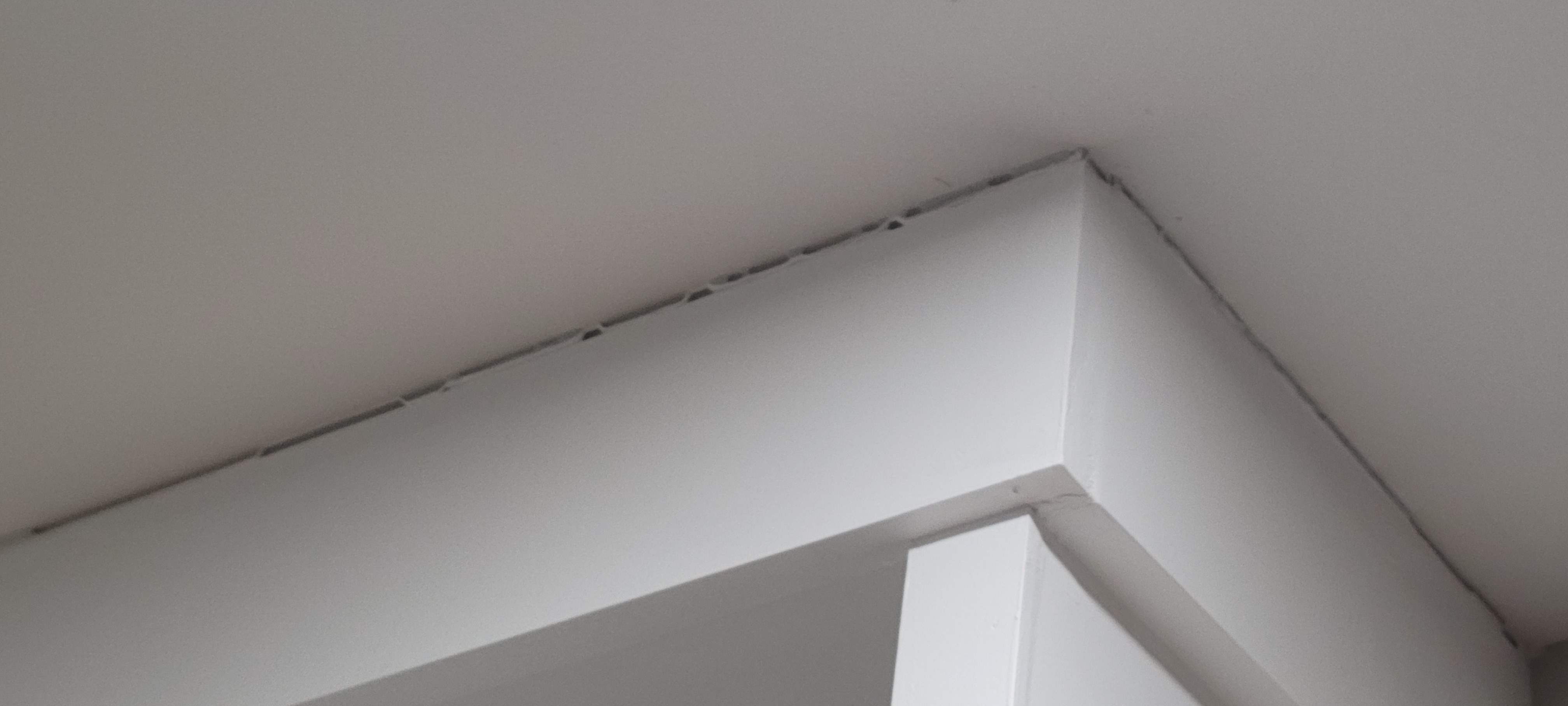
We had used our go-to stretchy caulk that has always worked wonders for us — and seemingly lasts for years without cracking or splitting. We soon realized where things went south on this piece, though — if you scroll back to the original pictures above, you will see the first easter egg (clue) to what likely caused this blessing-in-disguise tragedy.
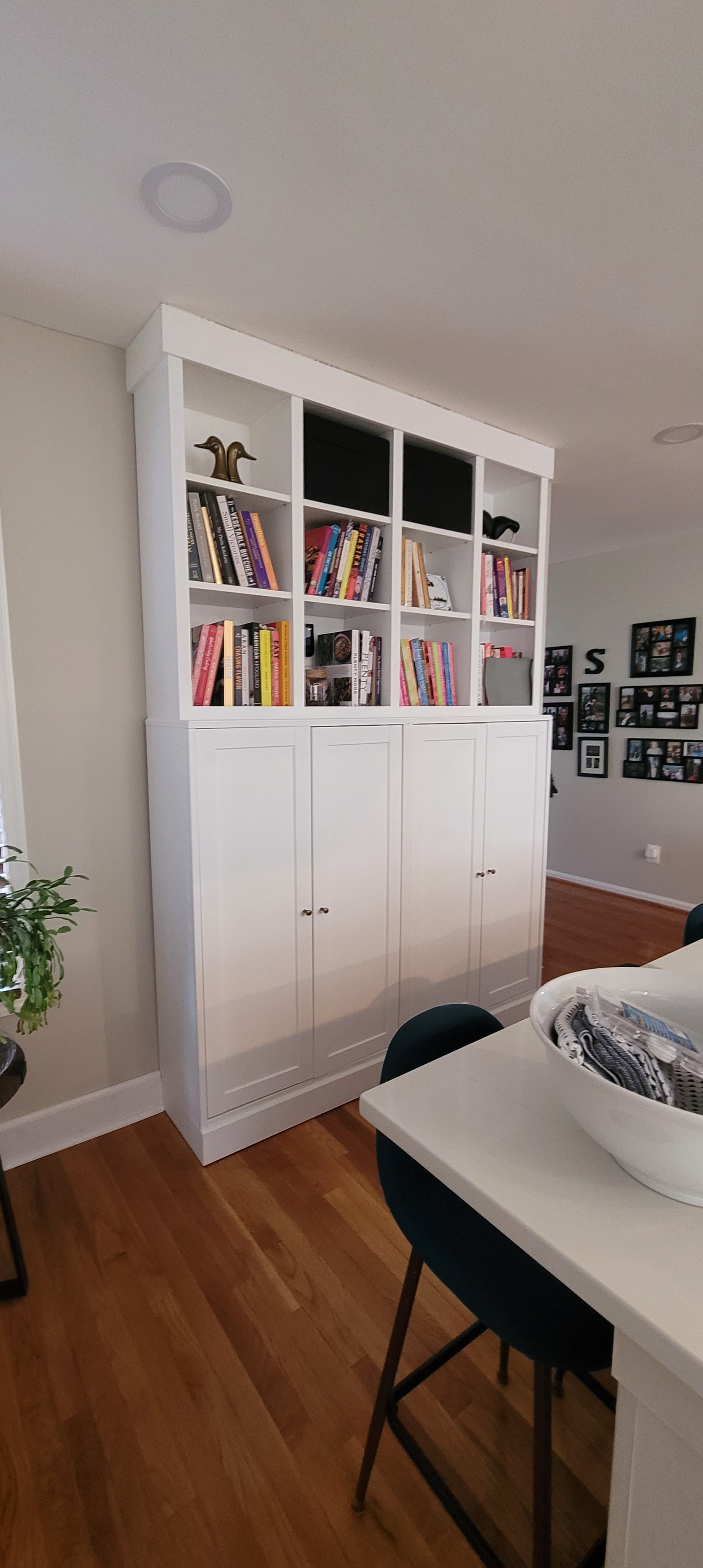
When the piece was originally finished, painted and caulked, we got to work loading it up with all the fun stuff it was meant to house. In the interior cabinets were small appliances and pantry items like canned and jarred goods. In the upper open shelving were a ton (remember that word, your second easter egg of this debacle) of books in my cookbook collection.
And that led us to the culprit.
We loaded this thing up after we caulked, and naturally — because gravity — the weight pulled the entire unit down, hence the separation between crown and ceiling.
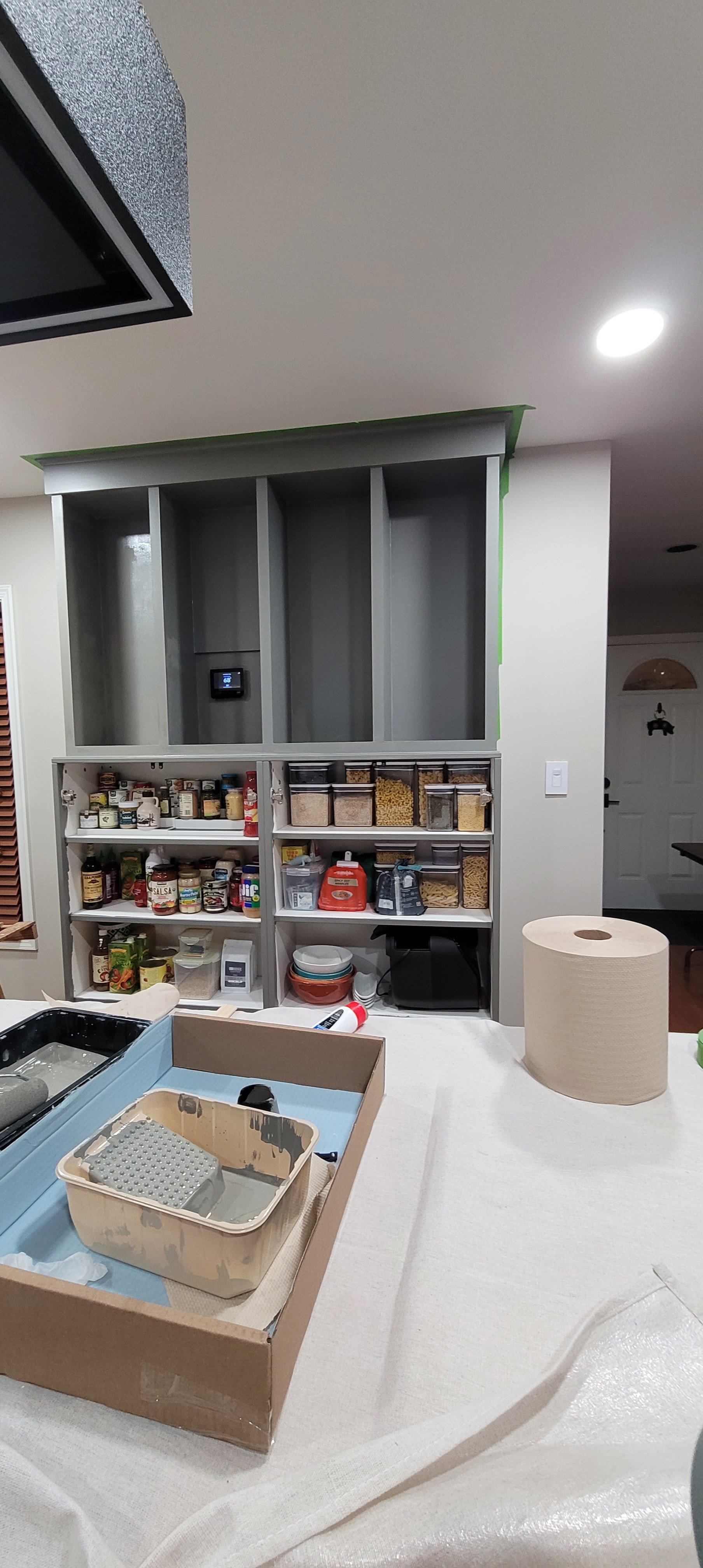
Because we knew we wanted to change the color on the unit anyway, we used the opportunity to add some additional trim to the crown to hide the separation, and then set about to painting the whole shebang, once again. Big sigh.
What we didn’t do was caulk the piece of crown trim to the ceiling prior to finishing. Once we get the thing painted out (I’m going to hyperventilate if I keep these big sighs up), we will load all the books and appliance back in and THEN caulk the ceiling.
We struggled to choose a color that would blend with the kitchen and not be too much of a distraction. We originally set our sight on black, but then thought it might scream, “Look at me!” from the back wall of our kitchen. Because our kitchen walls (along with the whole house and the walls of the massive island) are painted Benjamin Moore’s Edgecomb Grey (a soothing, beigey/grey — the kids call it ‘greige’ these days), Ben (Moore, that is) recommended a number of complementary colors that go with Edgecomb Grey, including a navy blue and a deep putty grey. Navy blue, especially on islands, has been done to death — similar to its ship-lap cousin in popularity, it was a little too on-trend, and besides, all the TikTokers tell us the navy island era has passed.
So, we went with…drumroll, please! Benjamin Moore’s Chelsea Grey! It is exclamation-point-palooza over here with that decision behind us. Seriously, you don’t really want to know how long it took us to choose the color. When we saw it weirdly, and identically, matched the veining in our quartz countertops, we were flipping sold.
Here she is, with the first coat on. So far so good, but keep in mind, I said the same thing when we got the first coat of white on her, now many moons ago. We also changed sheens from a Matte to an Eggshell, so we’ll see if we can contain our excitement (and use of exclamation points) when we see that gloss-up happening on the second coat.

We should be done soon — the only motivation I have is that our kitchen once again looks like a construction zone. We could open a small paint supply store with all the bins we have of painting supplies. “Oh, look, they’re giving away free paint stirrers!”
